Sukoon Spa
Client
Health and Wellness
Industry
Branding, Brand Strategy & Marketing
Services
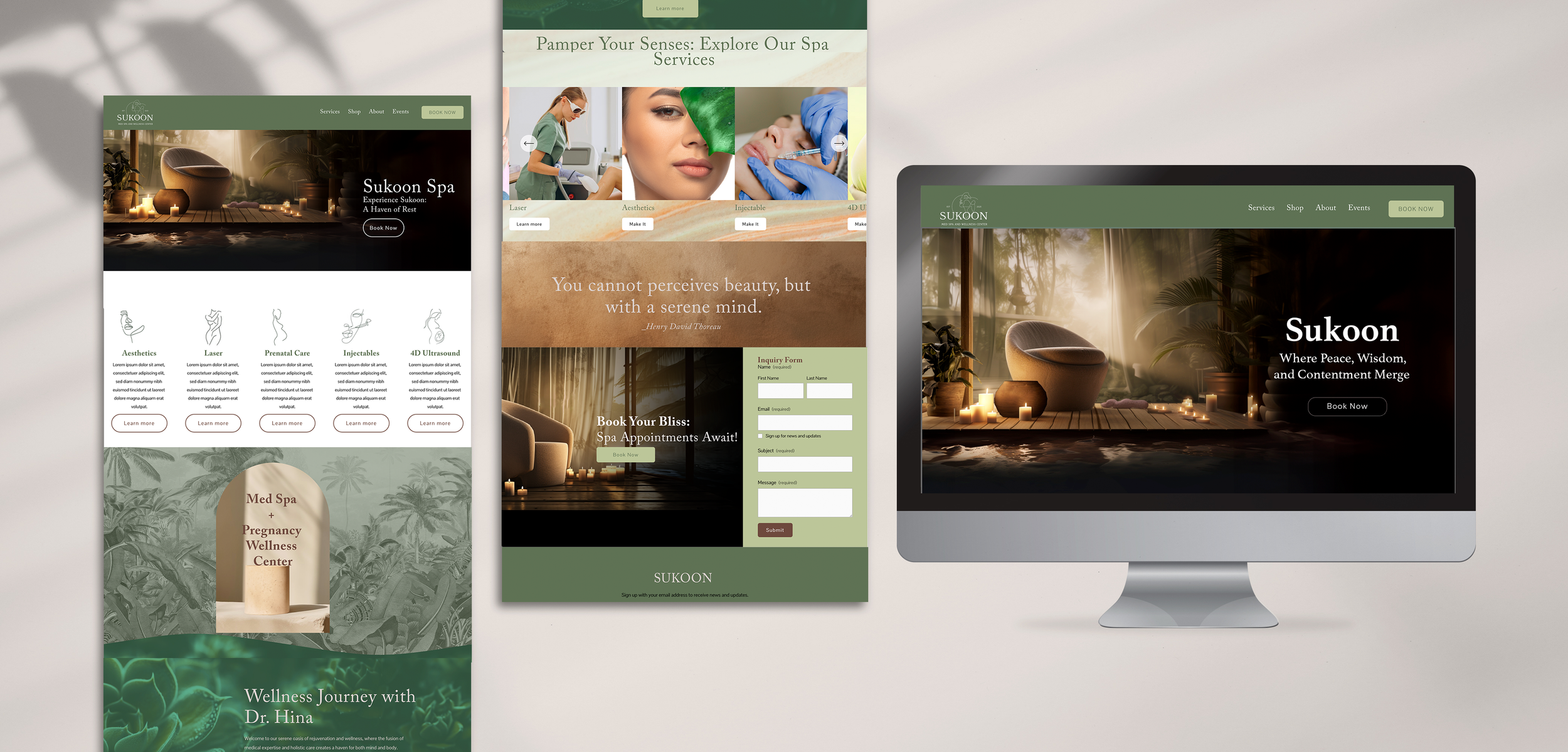
Sukoon Spa's Alluring New Website Design
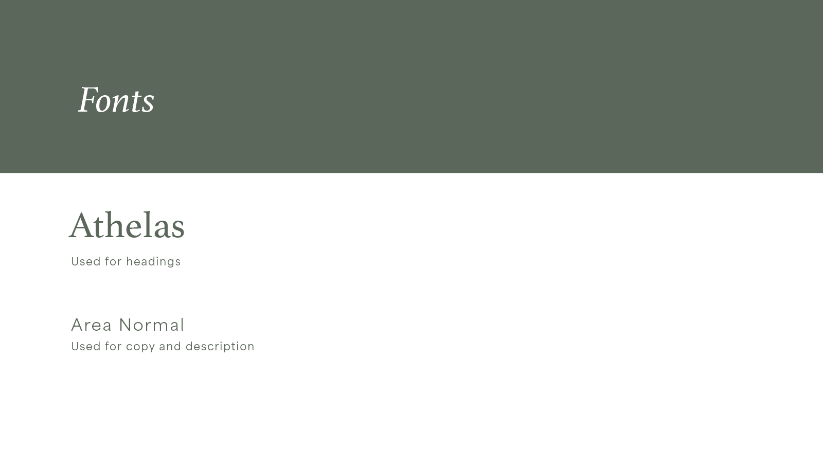
Sukoon Spa, a brand-new relaxation haven, was about to welcome its first visitors, and we were entrusted with the creation of their website. With a commitment to staying true to their eco-conscious identity, we incorporated the brand's lush green color as the cornerstone of our new design. In addition to this, we carefully curated a supporting color palette that harmonized with their primary shade. Our typography choices were not only visually appealing but also contributed to a seamless user experience.

Furthermore, we meticulously crafted a well-structured site map to ensure effortless navigation. To enhance the aesthetics of the website, we harnessed the power of AI to generate captivating images that resonate with our brand's essence. The end result is a captivating website layout that not only embodies the essence of Sukoon Spa but is also exceptionally user-friendly. Our intuitive user interface effortlessly guides visitors to the ultimate call to action: booking a rejuvenating session with us.
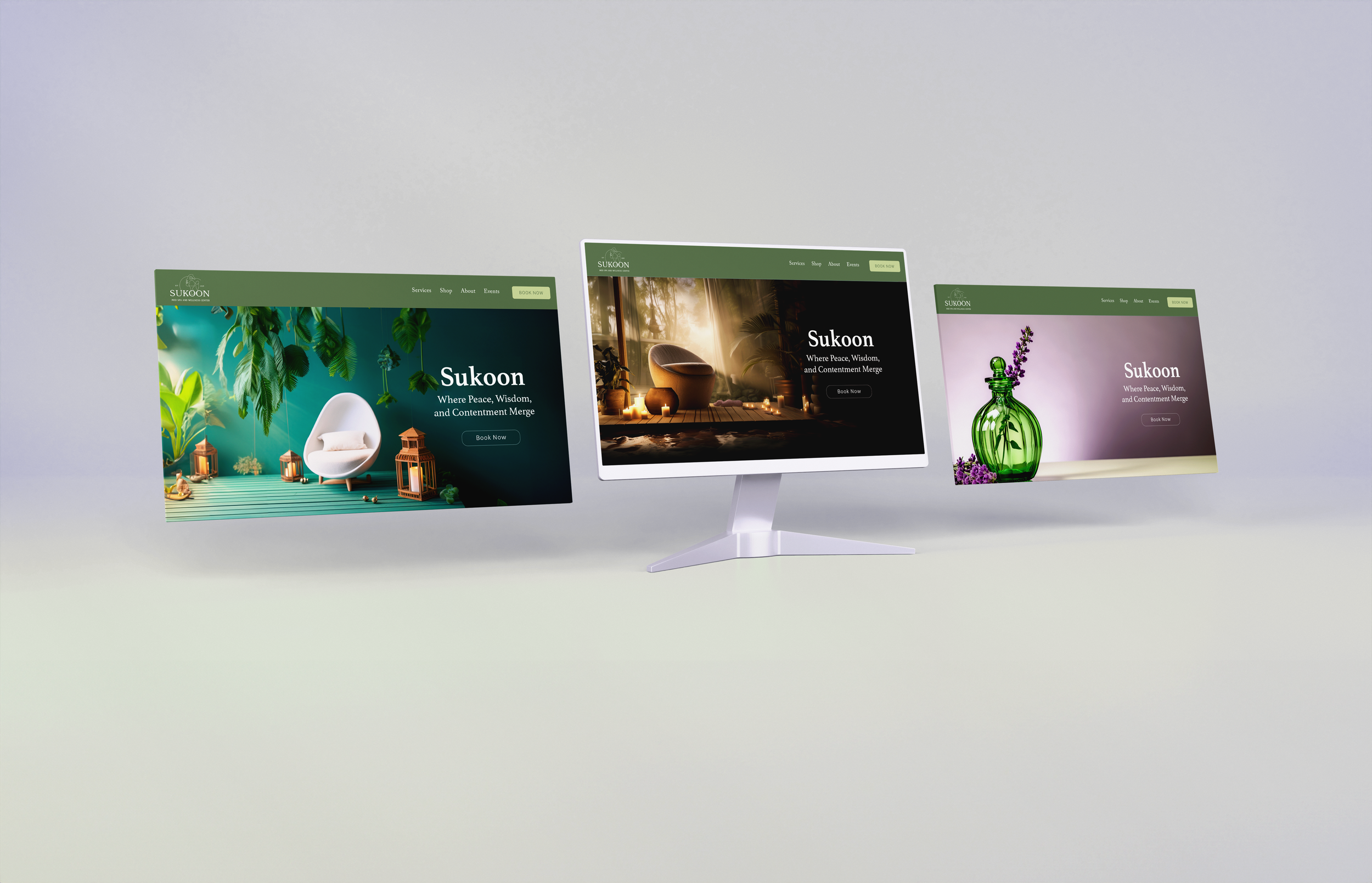
Putting the Components Together