Frisco Women
Client
Women Association
Industry
Branding, Brand Strategy & Marketing
Services
Unveiling Frisco Women’s Fresh Logo & Brand Identity
We carefully selected a bold, curvy, and flexible font to complement our logo, reflecting the dynamic and diverse nature of the group. We designed the logo with a focus on strong, independent, and confident women who come together to embrace the joy of togetherness and fun..

We opted for a vibrant hot pink color to symbolize confidence, and we paired it with cheerful yellow, representing the warmth and camaraderie that defines the group and added a light pink to complement the bold colors.
Vibrant Color Palette

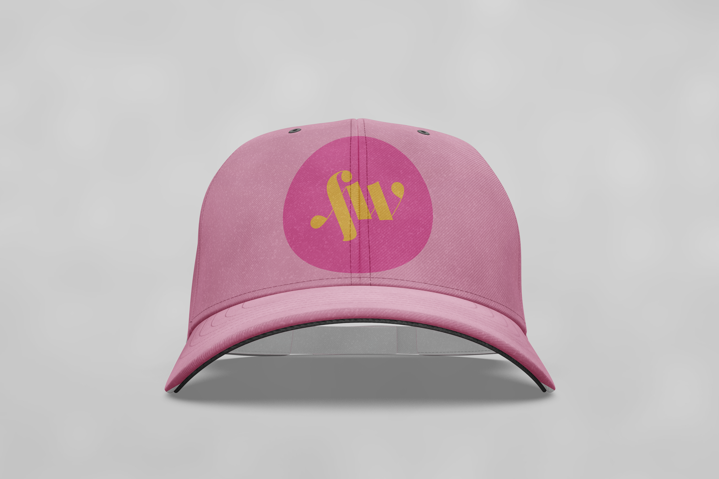
A submark is a smaller, simplified version of the primary logo. It typically consists of a distinctive and easily recognizable symbol or icon, often derived from elements of the main logo. Submarks will be used for various purposes, such as social media profile pictures, watermarking, or as a more compact representation when the full logo is too detailed or doesn't fit well in a particular space. The submark will maintain brand consistency and help reinforce brand recognition across different platforms and materials. Submarks are a valuable part of a brand's visual identity system, offering versatility while ensuring the brand remains cohesive and memorable.
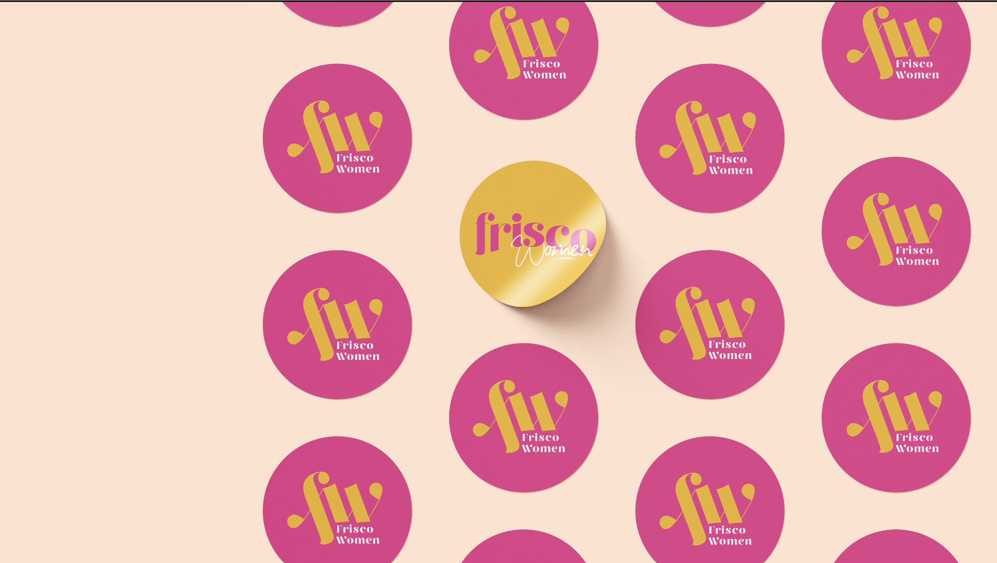
Submark

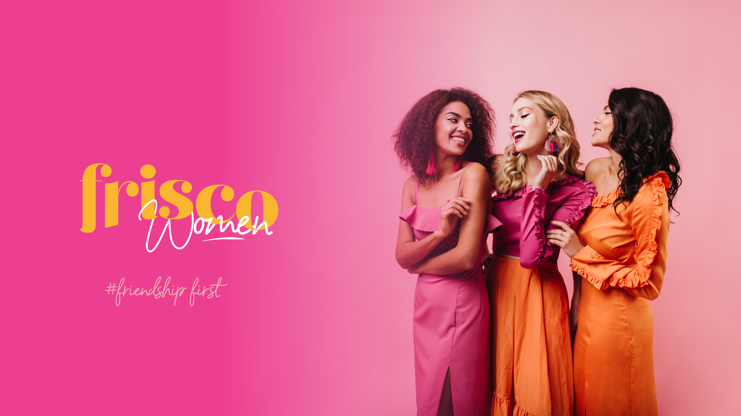
We've created a captivating series of lifestyle posters that capture the essence of the Frisco Women group, featuring the joyful moments of their meetups. Our design concept is rooted in the group's core value: friendship first, and business second.
Poster Series


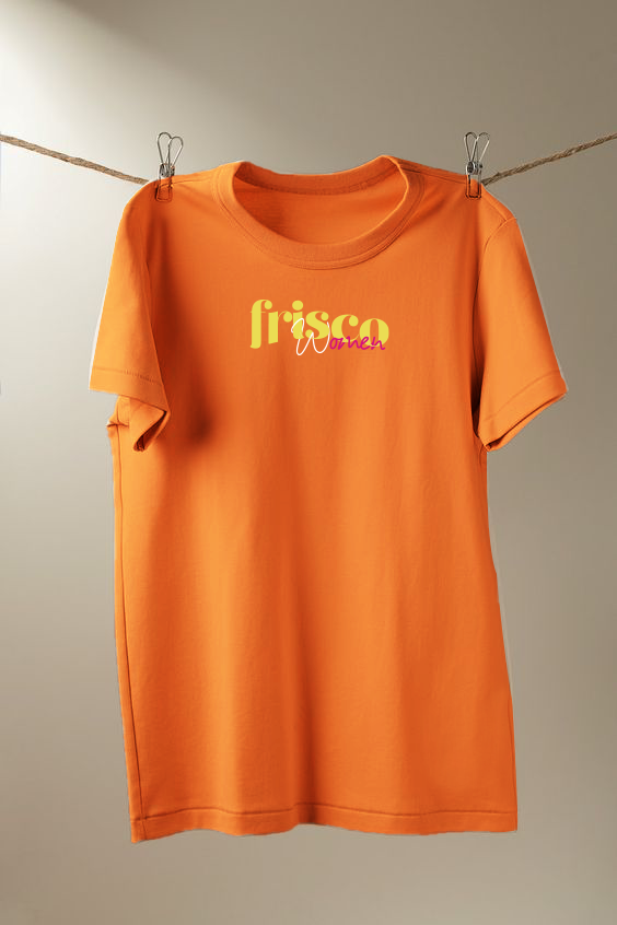
Promotional Materials