The Power of the Palette: How Pantone Colors Shape the Design World
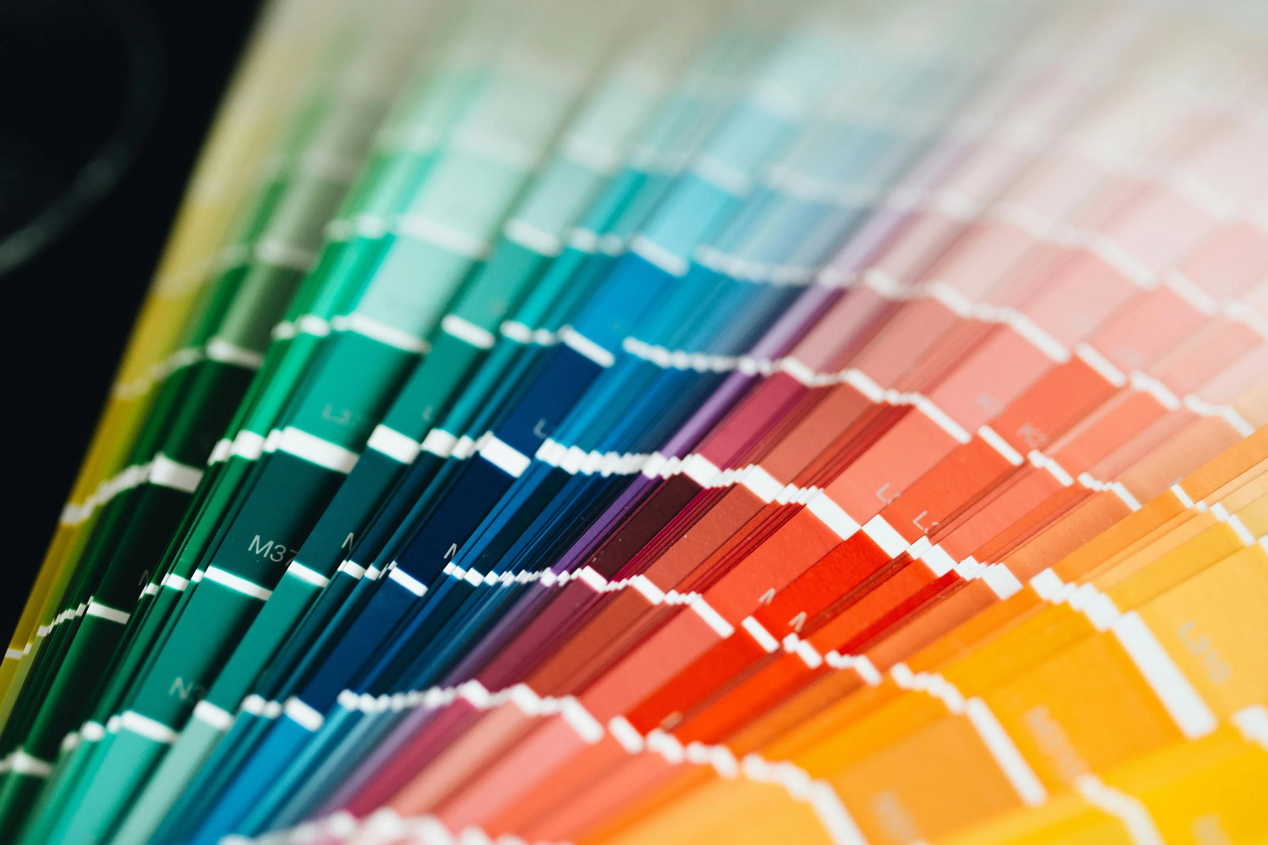
Photo by Peter Olexa
Colors evoke emotions, influence perception, and drive trends. In the design industry, mastering the language of color is key, and for many designers, this fluency begins with Pantone. Over the years, Pantone has established itself as a color authority, influencing everything from fashion runways to our living rooms. But how exactly does this color system influence the design industry? Let's explore the world of Pantone and its powerful impact.
Standardization and Communication:
Before Pantone, color selection was a difficult decision taking a lot of time and thought. At that time, designers relied on descriptions and printing methods, which led to frustrating mismatches. In the 1950s, Lawrence Herbert, a printing company manager, modernized this by creating the Pantone Matching System (PMS). This standardized numbering system assigned codes to specific colors, ensuring consistent reproduction across different materials and printers. The introduction of this system became a game-changer, enabling designers and manufacturers to communicate color choices precisely which resulted in streamlining workflows and guarantee of color accuracy.
Beyond Standardization: Inspiration and Trendsetting:
While standardization formed the foundation, Pantone didn't stop there. The Pantone Color Institute (PCI), established in 1990, started understanding the deeper roots of color in the culture and society. Each year, the PCI selects a Color of the Year, based on extensive research and trend analysis. This chosen color, e.g. 2023's "Viva Magenta," becomes a source of inspiration for designers across various disciplines. From fashion houses to home decorators, the Color of the Year shapes design direction.
Building Brand Identities:
As I have mentioned, colors influence people’s perceptions and drive new trends in the industry. They also play a vital role in brand recognition and communication. Brands like Tiffany & Co. and Coca-Cola have successfully leveraged specific Pantone colors to build strong brand identities. By incorporating these designated colors into logos, packaging, and marketing materials, brands create a unique visual identity that resonates with their target audience and strengthens their brand values.
Impacting More Than Just Visuals:
While the visual impact of a brand on the target audience is undeniable, Pantone's influence extends beyond aesthetics. Colors trigger psychological responses, and designers use this knowledge to evoke specific emotions or moods in their designs. Let’s say, a calming blue for a healthcare facility or a vibrant orange for a gym are two different examples of how Pantone colors can shape our experience and influence our behavior.
A Global Language of Color:
From fashion houses to local design studios, Pantone has established itself as a universal language of color. Its insightful trend analysis provides designers from every industry, with a source of inspiration. Whether it is ensuring color accuracy in production or looking for inspiration, Pantone's impact on the design industry is undeniable. As the industry continues to evolve, so will Pantone, adapting and innovating designers everywhere.
Now, let's talk about 2024's Color of the Year: "Fuzzy Peach"! This soft, warm pinkish-orange hue, described as "velvety, gentle, and subtly sensual," was chosen by the PCI as the color of this year. It is said to reflect our yearning for "closeness, connection, and warmth." Expect to see "Fuzzy Peach" in new trends across various fields throughout the year, from fashion and graphic design to interior design and product packaging.